气球图(ballon plot)
简介
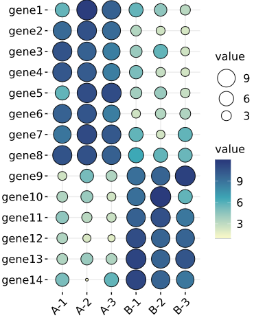
用圆形大小展示矩阵中各值的大小,并以颜色深浅表示值大小。人们往往对数值不敏感,对大小及颜色比较敏感。所以此图可以更直观地展示数据。调用ggpubr
数据说明
矩阵形式数据,第一行,第一列分别为名字,其他为数值(需均为正值)
论文例子
Genome-wide identification and characterization of the KCS gene family in sorghum (Sorghum bicolor (L.) Moench) Fig2
如何引用?
建议直接写网址。助力10000+篇
(google学术),9000+篇
(知网)论文
正式引用:Tang D, Chen M, Huang X, Zhang G, Zeng L, Zhang G, Wu S, Wang Y.
SRplot: A free online platform for data visualization and graphing. PLoS One. 2023 Nov 9;18(11):e0294236. doi: 10.1371/journal.pone.0294236. PMID: 37943830.
方法章节:Heatmap was plotted by https://www.bioinformatics.com.cn (last accessed on May 4, 2026), an online platform for data analysis and visualization.
致谢章节:We thank Mingjie Chen (Shanghai NewCore Biotechnology Co., Ltd.) for providing data analysis and visualization support.